

Is It Still All About Oil?
Modern times demand modern thinking in portfolio design. Learn more...
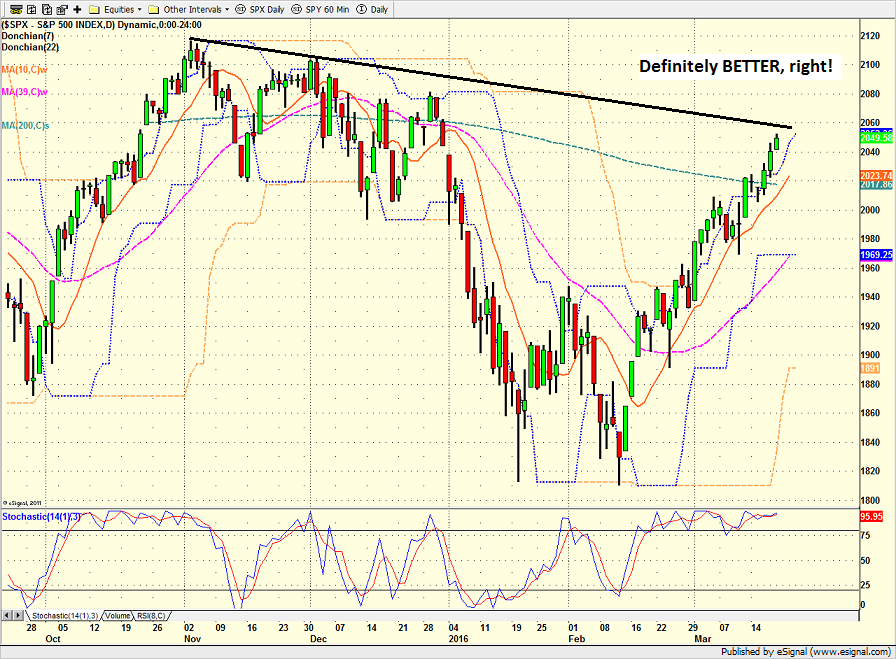
There is no denying that the U.S. stock market has enjoyed a dramatic turnaround over the last 25 trading days. The S&P 500 has rallied 12.05% since the February 11 low, the DJIA has added nearly 2,000 points (1942 to be exact), and the NASDAQ has gained 12.4%. Not bad, not bad at all.
On February 11th, traders thought the oil bust was going to drag the U.S. economy into recession. On February 11th, the worry was that the banks were in trouble. And on February 11th, the bears were firmly in control of the action.
Then it happened - the expected oversold bounce began. As is usually the case in this type of situation, stocks surged up from an oversold condition. Things had simply gotten too negative. Three days later, the most recent leg down had been erased and things were looking/feeling a bit better.
Even the most ardent bear expected this bounce. Everybody knows that stocks rarely, if ever, move in a straight line and when the environment becomes as negative as it had been in mid-February, a dead-cat bounce is just part of the game. But few gave the move much chance of continuing as the damage done to the markets had become severe.
But continue it did. Right through the near-term resistance. Right through the key moving averages. And right through the Fibonacci retracement levels - despite the fact that all of the above were expected to provide to stop this bounce in its tracks.
S&P 500 - Daily 
View Larger Image
So, 25 trading days later, the stock market appears to be out of the danger zone and the bulls are talking about new all-time highs.
The Question of the Day Is...
But before we get too excited, it is important to take a step back and look at the causes of the rebound and then to try and answer the obvious question: Is the move sustainable?
If investors have learned anything since the credit crisis, it is that when things start to get bad, the world's central bankers have tended to saddle up their white horses and ride to the rescue. Over and over again. And sure enough, this time was no different.
Just about the time everyone was sure that the bears were back and that a replay of 2008 was at hand, the People's Bank of China, the Bank of Japan, and Mario Draghi got busy. And by now, every trader worth their salt knows how to play the central bank intervention game.
Along with surprise moves in China and talk of more QE in Europe came improved economic data in the U.S. And by the time Super Mario got around to actually firing his QE bazooka, stocks were in the process of discounting better days ahead.
To be sure, things have improved in the markets. The economic outlook is a better. The banks are better. And my longer-term, big picture indicators are better.
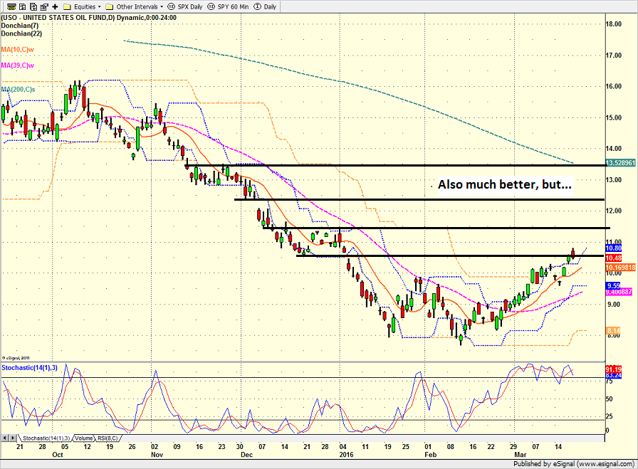
However, it is important to recognize that oil too has enjoyed a strong rally over the period of time in question. And given that stocks and crude have been joined at the hip for quite some time now, I have to question whether the current rally is anything more than a continuation of the oil correlation trade.
Lest we forget, the USO has popped more than 32% during the stock market rally. And while the daily correlation between oil and stocks seems to be fading a bit, the bottom line is that when oil goes up, stocks go up.
US Oil Fund (NYSE: USO) - Daily 
View Larger Image
It is important to recognize that oil probably doesn't have to continue rally for stocks to improve further. The key was for crude's rude move to end. And with oil now up off the mat, the argument can be made that the chance of contagion now must be reduced as well.
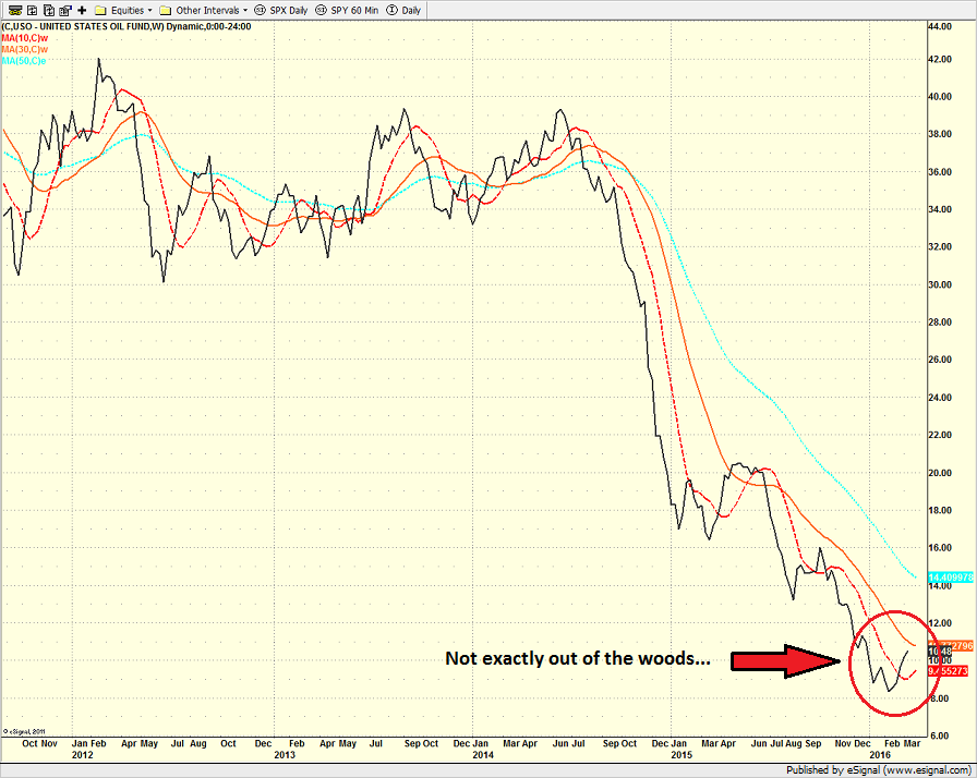
However, as the weekly chart of oil shows, the situation in the oil patch isn't suddenly "all better now."
US Oil Fund (NYSE: USO) - Weekly 
View Larger Image
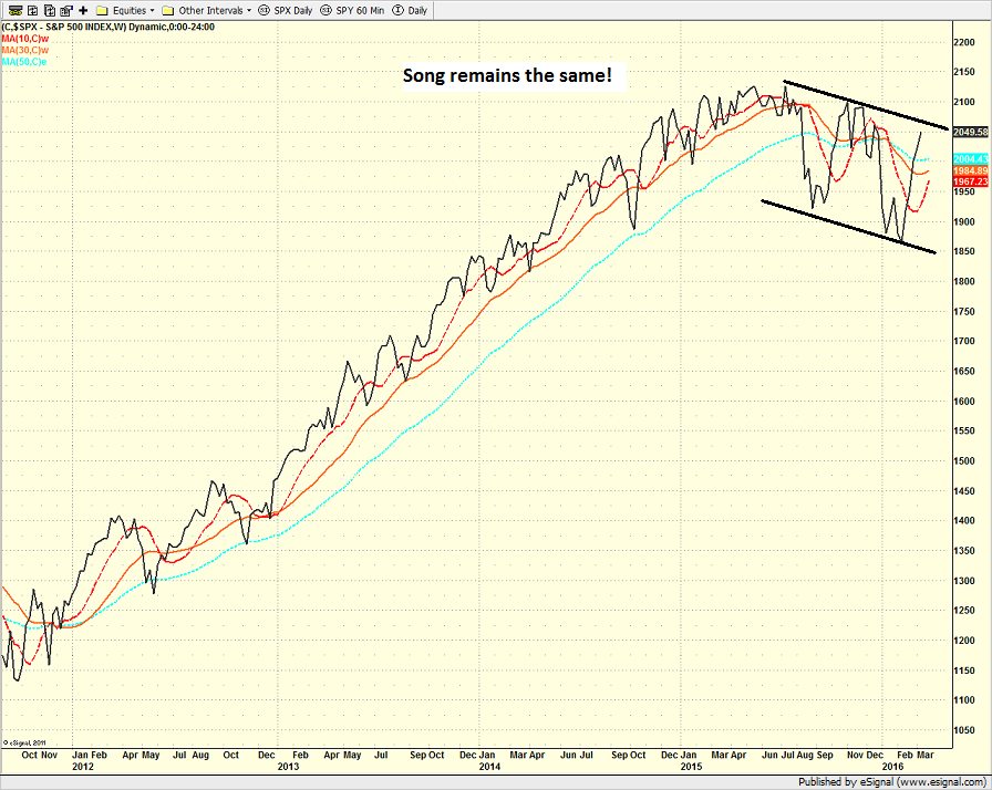
Then if we take a look at the weekly chart of the S&P 500, it is fairly clear that we should perhaps keep the champagne on ice for a while yet - at least until the bulls can break the downtrend and/or make a new high.
S&P 500 - Weekly 
View Larger Image
In summary, things have definitely improved for stock market investors on many fronts and we may indeed be out of the danger zone. However, until stocks can decouple from oil and show that they can rally without the help of green arrows in the oil pit, I'm going to try and curb my enthusiasm.
In short, my plan, as always, is to stay in tune with the overall risk/reward environment, which, at this stage, means a high neutral to moderately positive stance.
Publishing Note: My father had extensive open heart surgery late last week. As such, my oftentimes meandering morning market missive will be written as time permits for the next week or so.
Today's Pre-Game Indicators
Here are the Pre-Market indicators we review each morning before the opening bell...
Major Foreign Markets:
Japan: -1.25%
Hong Kong: +0.06%
Shanghai: +2.15%
London: -0.24%
Germany: -0.21%
France: -0.63%
Italy: +0.35%
Spain: -0.18%
Crude Oil Futures: +$0.23 to $39.53
Gold: -$10.00 at $1244.10
Dollar: lower against the yen, higher vs. euro and pound
US 10-Year Bond Yield: Currently trading at 1.904%
German 10-Year Bund Yield: Currently trading at 0.235%
Stock Indices in U.S. (relative to fair value):
S&P 500: -5.30
Dow Jones Industrial Average: -24
NASDAQ Composite: -11.15
Thought For The Day:
No one can make you feel inferior without your consent. -Eleanor Roosevelt
Here's wishing you green screens and all the best for a great day,

David D. Moenning
Founder: Heritage Capital Research
Chief Investment Officer: Sowell Management Services
Looking for More on the State of the Markets?
!function(d,s,id){var js,fjs=d.getElementsByTagName(s)[0],p=/^http:/.test(d.location)?'http':'https';if(!d.getElementById(id)){js=d.createElement(s);js.id=id;js.src=p+'://platform.twitter.com/widgets.js';fjs.parentNode.insertBefore(js,fjs);}}(document, 'script', 'twitter-wjs');Current Market Drivers
We strive to identify the driving forces behind the market action on a daily basis. The thinking is that if we can both identify and understand why stocks are doing what they are doing on a short-term basis; we are not likely to be surprised/blind-sided by a big move. Listed below are what we believe to be the driving forces of the current market (Listed in order of importance).
1. The State of the Oil Crisis
2. The State of Global Central Bank Policy
3. The State of the Stock Market Valuations
4. The State of Global Growth
The State of the Trend
We believe it is important to analyze the market using multiple time-frames. We define short-term as 3 days to 3 weeks, intermediate-term as 3 weeks to 6 months, and long-term as 6 months or more. Below are our current ratings of the three primary trends:
Short-Term Trend (1 - 3 Weeks): Positive
(Chart below is S&P 500 daily over past 1 month)
Intermediate-Term Trend (1 - 6 Months): Neutral
(Chart below is S&P 500 daily over past 6 months)
Long-Term Trend (6 - 18 Months): Moderately Negative
(Chart below is S&P 500 daily over past 2 years)
Key Technical Areas:
Traders as well as computerized algorithms are generally keenly aware of the important technical levels on the charts from a short-term basis. Below are the levels we deem important to watch today:
- Key Near-Term Support Zone(s) for S&P 500: 2000(ish)
- Key Near-Term Resistance Zone(s): 2080
The State of the Tape
Momentum indicators are designed to tell us about the technical health of a trend - I.E. if there is any "oomph" behind the move. Below are a handful of our favorite indicators relating to the market's "mo"...
- Trend and Breadth Confirmation Indicator (Short-Term): Positive
- Price Thrust Indicator: Positive
- Volume Thrust Indicator(NASDAQ): Positive
- Breadth Thrust Indicator (NASDAQ): Positive
- Short-Term Volume Relationship: Positive
- Technical Health of 100+ Industry Groups: Moderately Positive
The Early Warning Indicators
Markets travel in cycles. Thus we must constantly be on the lookout for changes in the direction of the trend. Looking at market sentiment and the overbought/sold conditions can provide "early warning signs" that a trend change may be near.
- S&P 500 Overbought/Oversold Conditions:
- Short-Term: Overbought
- Intermediate-Term: Overbought
- Market Sentiment: Our primary sentiment model is Neutral
The State of the Market Environment
One of the keys to long-term success in the stock market is stay in tune with the market's "big picture" environment in terms of risk versus reward.
- Weekly Market Environment Model Reading: Moderately Positive
Indicator Explanations
Trend and Breadth Confirmation Indicator (Short-Term) Explained: History shows the most reliable market moves tend to occur when the breadth indices are in gear with the major market averages. When the breadth measures diverge, investors should take note that a trend reversal may be at hand. This indicator incorporates an All-Cap Dollar Weighted Equity Series and A/D Line. From 1998, when the A/D line is above its 5-day smoothing and the All-Cap Equal Weighted Equity Series is above its 25-day smoothing, the equity index has gained at a rate of +32.5% per year. When one of the indicators is above its smoothing, the equity index has gained at a rate of +13.3% per year. And when both are below, the equity index has lost +23.6% per year.
Price Thrust Indicator Explained: This indicator measures the 3-day rate of change of the Value Line Composite relative to the standard deviation of the 30-day average. When the Value Line's 3-day rate of change have moved above 0.5 standard deviation of the 30-day average ROC, a "thrust" occurs and since 2000, the Value Line Composite has gained ground at a rate of +20.6% per year. When the indicator is below 0.5 standard deviation of the 30-day, the Value Line has lost ground at a rate of -10.0% per year. And when neutral, the Value Line has gained at a rate of +5.9% per year.
Volume Thrust Indicator Explained: This indicator uses NASDAQ volume data to indicate bullish and bearish conditions for the NASDAQ Composite Index. The indicator plots the ratio of the 10-day total of NASDAQ daily advancing volume (i.e., the total volume traded in stocks which rose in price each day) to the 10-day total of daily declining volume (volume traded in stocks which fell each day). This ratio indicates when advancing stocks are attracting the majority of the volume (readings above 1.0) and when declining stocks are seeing the heaviest trading (readings below 1.0). This indicator thus supports the case that a rising market supported by heavier volume in the advancing issues tends to be the most bullish condition, while a declining market with downside volume dominating confirms bearish conditions. When in a positive mode, the NASDAQ Composite has gained at a rate of +38.3% per year, When neutral, the NASDAQ has gained at a rate of +13.3% per year. And when negative, the NASDAQ has lost at a rate of -8.5% per year.
Breadth Thrust Indicator Explained: This indicator uses the number of NASDAQ-listed stocks advancing and declining to indicate bullish or bearish breadth conditions for the NASDAQ Composite. The indicator plots the ratio of the 10-day total of the number of stocks rising on the NASDAQ each day to the 10-day total of the number of stocks declining each day. Using 10-day totals smooths the random daily fluctuations and gives indications on an intermediate-term basis. As expected, the NASDAQ Composite performs much better when the 10-day A/D ratio is high (strong breadth) and worse when the indicator is in its lower mode (weak breadth). The most bullish conditions for the NASDAQ when the 10-day A/D indicator is not only high, but has recently posted an extreme high reading and thus indicated a thrust of upside momentum. Bearish conditions are confirmed when the indicator is low and has recently signaled a downside breadth thrust. In positive mode, the NASDAQ has gained at a rate of +22.1% per year since 1981. In a neutral mode, the NASDAQ has gained at a rate of +14.5% per year. And when in a negative mode, the NASDAQ has lost at a rate of -6.4% per year.
Bull/Bear Volume Relationship Explained: This indicator plots both "supply" and "demand" volume lines. When the Demand Volume line is above the Supply Volume line, the indicator is bullish. From 1981, the stock market has gained at an average annual rate of +11.7% per year when in a bullish mode. When the Demand Volume line is below the Supply Volume line, the indicator is bearish. When the indicator has been bearish, the market has lost ground at a rate of -6.1% per year.
Technical Health of 100 Industry Groups Explained: Designed to provide a reading on the technical health of the overall market, this indicator takes the technical temperature of more than 100 industry sectors each week. Looking back to early 1980, when the model is rated as "positive," the S&P has averaged returns in excess of 23% per year. When the model carries a "neutral" reading, the S&P has returned over 11% per year. But when the model is rated "negative," stocks fall by more than -13% a year on average.
Weekly State of the Market Model Reading Explained:Different market environments require different investing strategies. To help us identify the current environment, we look to our longer-term State of the Market Model. This model is designed to tell us when risk factors are high, low, or uncertain. In short, this longer-term oriented, weekly model tells us whether the odds favor the bulls, bears, or neither team.
Disclosures
The opinions and forecasts expressed herein are those of Mr. David Moenning and may not actually come to pass. Mr. Moenning's opinions and viewpoints regarding the future of the markets should not be construed as recommendations. The analysis and information in this report is for informational purposes only. No part of the material presented in this report is intended as an investment recommendation or investment advice. Neither the information nor any opinion expressed constitutes a solicitation to purchase or sell securities or any investment program.
Any investment decisions must in all cases be made by the reader or by his or her investment adviser. Do NOT ever purchase any security without doing sufficient research. There is no guarantee that the investment objectives outlined will actually come to pass. All opinions expressed herein are subject to change without notice. Neither the editor, employees, nor any of their affiliates shall have any liability for any loss sustained by anyone who has relied on the information provided.
The analysis provided is based on both technical and fundamental research and is provided "as is" without warranty of any kind, either expressed or implied. Although the information contained is derived from sources which are believed to be reliable, they cannot be guaranteed.
David D. Moenning is an investment adviser representative of Sowell Management Services, a registered investment advisor. For a complete description of investment risks, fees and services, review the firm brochure (ADV Part 2) which is available by contacting Sowell. Sowell is not registered as a broker-dealer.
Employees and affiliates of Sowell may at times have positions in the securities referred to and may make purchases or sales of these securities while publications are in circulation. Positions may change at any time.
Investments in equities carry an inherent element of risk including the potential for significant loss of principal. Past performance is not an indication of future results.
Advisory services are offered through Sowell Management Services.
Recent free content from FrontRange Trading Co.
-
 Is The Bull Argument Too Easy These Days?
— 8/31/20
Is The Bull Argument Too Easy These Days?
— 8/31/20
-
What Do The Cycles Say About 2020?
— 1/21/20
-
Modeling 2020 Expectations (Just For Fun)
— 1/13/20
-
Tips From Real-World Wendy Rhoades
— 5/06/19
-
The Best Recession Ever!
— 4/29/19
-
{[comment.author.username]} {[comment.author.username]} — Marketfy Staff — Maven — Member


- 1 Campus Martius, Suite #200Detroit, MI 48226
- +1 877 440 9464